You know what really presses our team’s buttons? Well, it’s actually buttons themselves; when vital components aren’t designed in an accessible way. This blog will show you how to create buttons to meet Web Content Accessibility Guidelines (WCAG) standards.
From the outside, buttons seem like such a simple premise. They give the ability to quickly tap or click to add items to your shopping cart or book the latest gig. However, not everyone uses these features in the same way, and accessible buttons are vital to ensure your website can be used by all users.
You’d be amazed how many sites fail website accessibility testing due to common component errors. To ensure your buttons meet the needs of millions of assistive technology users, there are some rules to follow.
When to use a link or a button
To start with, you need to decide if the information you are trying to convey actually should be a button. Though components can be styled to look similar, they actually do have a significantly different purpose.
Why does it matter? Because it affects a user’s expectations and can complicate their online experience. For example, a screen reader tells the user if it’s a link or a button. If they selected a button thinking it was going to complete an action but instead were directed elsewhere on a site, it would be quite disorientating.
Remember that a:
- Links purpose is to direct a user towards a destination.
- Button is used for the purpose of performing an action.
Let people see your website components
One of the core principles of accessible design is to make sure your content is perceivable. If insufficient colour contrasts are used, it rules out a large proportion of your visitors from being able to interact with your services. This has the same result if there is a lack of focus states.
Checking colour contrast ratios
There’s no point in making a shiny new button that no one can see. If there isn’t enough contrast between the button’s background colour and foreground text, it becomes illegible. Rendering it useless to users with low vision.
An example of good colour contrast ratios
You can easily read all of this text
An example of poor colour contrast ratios
It is difficult to read all of this text
An example of good colour contrast ratios:
You can easily read all of this text
An example of poor colour contrast ratios:
It is difficult to read all of this text
Contrast ratios need to be at least 4.5:1. to meet with WCAG. Read our blog ‘Accessibility and colour contrast: why does it matter?’ to learn how you can easily assess your colour contrasts for free.
Setting active focus states
If you find yourself lost whilst out on an adventure, there’s nothing more useful than finding a map which highlights ‘you are here’. This is the same for users on your website. Keyboard only users don’t want to tab through your site and not be able to see where they are on a page – finding themselves lost within your content. Active focus states, which are styled to be inclusive, fix that problem.
Most websites will use the CSS :hover pseudo-class to generate a noticeable difference in the style of the button, when hovering over using a mouse. However, when carrying out accessibility audits, we often notice that these same styles haven’t been carried over to the :focus pseudo-class.
The focus pseudo class is triggered when a user tabs onto a button using a keyboard and the styles should generally match those for the hover state in order to provide a consistent experience for users of all abilities.
Remember to make sure that your hover and focus styles also need to pass the minimum colour contrast ratio of 4.5:1.
Accessible Buttons – Style your Buttons
Along with checking your colour contrast ratios, there is a range of styling that needs to be implemented onto your buttons to provide an inclusive experience.
The target size of buttons is an important accessibility consideration. The WCAG 2.1 Success Criteria for 2.5.5 previously only advised on target sizes at AAA level; however, with the upcoming publication of 2.2, there will soon also be criteria at AA level.
In order to meet the new criteria, make sure that your buttons contain adequate padding and margins. It’s important to give additional consideration to how groups of buttons will be displayed on all screen sizes, ensuring there is plenty of space around them.
Accessible Buttons – Give Context to Users
Similar to hyperlinks, buttons need to provide context for your site visitors to understand the purpose of the required action.
A bad example of giving context
A good example of giving context
Unlike links, the description can be hidden within the coding. However, the button should still be relevant to the action. For example, a button that simply says ‘continue’ does not inform the user what they will be completing. Whilst a sighted user may be able to interpret what ‘continue’ means by surrounding content, without a description for users with cognitive impairments or people who are blind or have low vision, this will give no meaning. Instead, this could be labelled along the lines of ‘complete your payment’.
Accessible Buttons – The Use of ARIA Labels
This leads us to the subject of Accessible Rich Internet Applications (ARIA) labels.
ARIA labels allow developers to provide additional information to screen reader users without affecting the design of an interactive element, such as a button.
One of the most important uses of ARIA labels on buttons is when the content of the button is an icon. Website users with cognitive or visual impairments may struggle to associate the icon with the results of the action of pressing the button. ARIA labels allow us to add more information to provide more context to the user via assistive technology.
A good example is a close button that contains an icon of a cross that signifies to a user that it can be used to close or dismiss on being pressed:

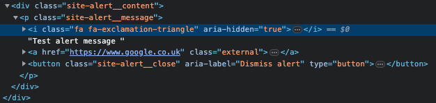
The ARIA label of “Dismiss alert” gives users using a screen reader more information otherwise it would be read out as simply “button”.
Learn more about ways that you can enhance your code through the use of semantic HTML for accessibility.
The frustration with disabled buttons
Often, buttons are disabled on forms until certain criteria are entered, such as requiring a name and an email address. Unfortunately, many forms don’t specify the information required prior. Also, if the information is entered incorrectly, the button does not enable and leaves users shut out of completing the action with no indication as to why. This problem can be eliminated by implementing clear error messaging.
Disabled buttons often use a colour palette (grey with decreased opacity) that can often fail to meet the minimum contrast ratio of 4.5:1.
If using the ‘disabled’ HTML attribute, it removes the interactiveness of the button. This means that it would be skipped over by keyboard users tabbing through the page.
Imagine being colour-blind, using a keyboard to navigate a web page and wondering why a button that looks the same as the others can’t be reached using the same navigation method.
Disabled buttons are a poor design choice and should generally be avoided, but if there is a use case where they must be implemented, then some consideration should be given to making them more accessible. There are some good examples in this article on CSS-tricks.
Need help with inclusive design?
Our accessibility experts can provide web accessibility training for designers and developers within your organisation. Giving you the confidence in knowing you are designing with accessibility at the forefront for all of your users.
 standards.)