You’ve probably heard the terminology alternative text used when looking into digital accessibility, but do you know the best inclusive practices on how to use and write it? If not, then this blog will talk you through all you need to create accessible image descriptions and how to add alt text to your digital content.
What is alternative text and why is it important?

Alternative text, also known as alt text, is crucial for digital accessibility. Think of any website, every one of them will have an array of enticing imagery to draw you towards content, to guide you through a website, or to help you to make a purchase.
Fundamentally, alt text is an accurate description of an image or its function on a web page, document, or social media platform. This description is then read aloud by a screen reader; allowing blind users and people with low vision to have equal access to that visual information.
What happens when alt text is not provided
When no alt text is added to an image, a screen reader will simply only read out the word “image” or the name of the file itself, such as “DSC0011.jpg”. This gives users no context to what could be critical information that is being displayed.
Even though there are millions of people in the UK alone who have sight loss, sadly, alt text is something that is still frequently missed off digital platforms or misused by organisations and individuals. This takes away people’s independence and leaves online visitors feeling frustrated and unconnected.
Tips for writing accessible image descriptions

Alt text should convey the images content or its function. The first step is thinking of what you are trying to achieve.
For example, there may be an image of a car in front of a scenic lake. If you were a travel firm, you would put more detail into explaining the surrounding landscape in the image. Whereas if you were trying to sell the vehicle in the picture, you would detail more about the car itself, such as the make, model, colour etc.
What you should do when writing effective alt text:

- Keep the description short. Try to capture the concept of the image in a sentence or two.
- Write accurate and relevant descriptions. You don’t have to describe every single thing in the picture, just the essentials that someone would need to know.
- Consider describing the angle a shot was taken at e.g. close-up.
- Write in plain language.
- Use punctuation like normal. Breaking up sentences makes it easier for screen reader users.
What you should avoid doing when adding alt text:

- Writing phrases such as ‘an image of’, as screen reading software already highlights this fact to the user.
- Putting very basic descriptions e.g. a dog.
- Duplicating text if it is in the document nearby to the image.
- Using automatically generated alt text, as they are usually not accurate.
- Writing acronyms in your alt text. Not only do they often cause confusion as to what they stand for, but a screen reader will pronounce each letter separately rather than read it as a word.
- Using alt text for a joke, publicity purposes, or to extend your copy. Keep it to only the image description.
- Using emojis, symbols, or hashtags in your descriptions.
- Adding photo credits in the hashtag feature.
What to do with complex image descriptions

When faced with the dilemma of what to do with imagery that consists of complex information, such as infographics, charts or maps, a short overview can be placed in the alt text field. A larger description should then be within the main body of text near to the image or with a link to the information on a separate page.
Circumstances when you should not add alt text
When adding decorative imagery
If an image is for purely decorative purposes, such as an icon or border to visually break up information, these do not need alt text adding as they provide no useful context.
On websites or within documents, you can set these images as ‘decorative’, or ‘null’ in the HTML. This will enable the screen reader to bypass these images.
It’s up to you as an author to decide whether you think an image is needed or not. Here’s a handy guide from the W3C which may help you to decide if your image is decorative or not.
Unfortunately, on social media you don’t have this option yet, so it is advised to still provide a short alt text description, so users don’t think they are missing out on any information.
Describing an image instead of its functional use
If an image is used as a hyperlink to another page or document, then the alt text should describe where the users will be directed, rather than what is in the image itself.
Good and bad alt text examples

You can be creative as you like with alt text, as long as it’s to the above rules.
Here’s a short example of how you can adapt your writing style to be more descriptive:
Bad: A person with a torch
Better: A person looking at the sky at night time with a head torch on.
Good: A silhouette of a man, who is stood on a mountain top wearing a head torch. He is looking to the night sky, which is illuminated by a dazzling array of stars in the Milky Way.
Life of a Blind Girl blogger, Holly Tuke, has shared some great best practice websites and social channels that you should take a look at. They give you a glimpse into just how creative you can be with your image descriptions.
The misuse of alt text
Unfortunately, the alt text feature is often misused, in particular across social media platforms.
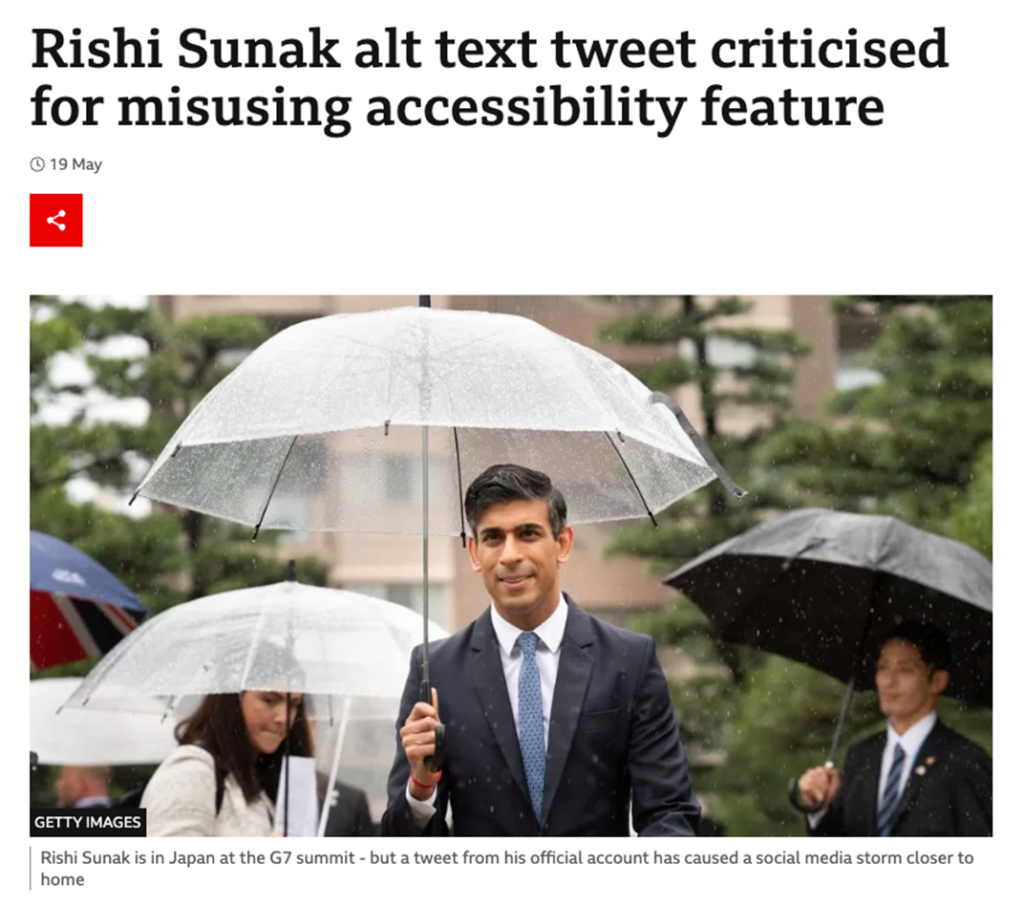
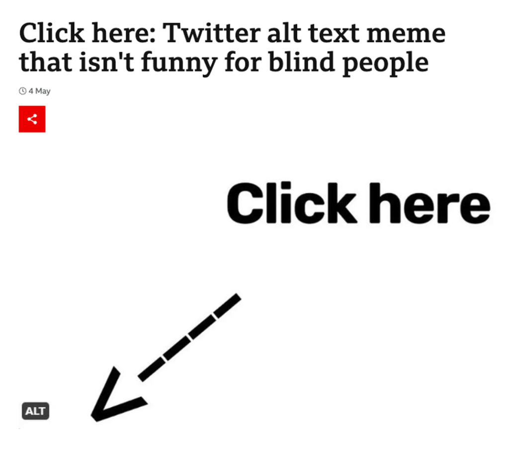
This has been to the point recently where it has made it to national news because of its impact on blind people and low sighted users. Even our own Prime Minister was criticised for its use, where instead of describing his photo, he added “We’re growing the economy”. Another craze was a tweet that was seen millions of times across the internet, from large organisations writing jokes within the alt text feature instead of its intended purpose – leaving visually impaired users very much out of the joke.
Below are two articles, explaining just why the misuse of alt text in these ways have such a negative affect for online users:
How to add alt text to digital platforms
It varies depending what platform you use, but here are some of the top communication platforms:
Social media
Here are some quick videos showing you how to add alt text to your social posts: