Case study brief: Accessibility audit testing for Confluence Technologies
Confluence Technologies is a global technology solutions provider. They help the investment management industry solve complex investment data challenges, reduce risk, and increase efficiency.
Confluence approached HeX Productions in need of having their internal Revolution platforms accessibility audit tested.
Confluence is primarily based in the United States. Therefore, we had to ensure that their accessibility audit tested against both the Rehabilitation Act’s ICT Accessibility 508 Standards, and the Accessibility for Ontarians with Disabilities Act (AODA). These Acts incorporate Web Content Accessibility Guidelines (WCAG) 2.0 success criteria.
HeX's ICT Accessibility 508 Standards knowledge made this case study unique
Confluence’s Revolution is a cloud-based platform offering analysis of internal performance, and manages attribution, risk and compliance data.
Information on this platform mainly contained statistical data, presented in an array of tables, graphs, and data charts. Unfortunately, these content types often do not pass accessibility standards and must be correctly structured to become accessible.
Luckily, for Confluence, our digital web agency are experts in accessibility! Our team provided consultancy to guide their team through the changes their content required, in order to comply with the legal ICT Accessibility 508 Standard.
Accessibility audit testing activities delivered
- Automated audit software scanning of internal platforms.
- Manual user testing with a pan-disabled team. Using assistive technology software and devices to test the website’s accessibility.
- A technical review of the site, from HeX expert developers. They assessed codebase errors and where ARIA (Accessible Rich Internet Applications) could enhance the user experience.
- A comprehensive report detailing site accessibility barriers and enhancements. Creating a roadmap of required changes.
- Accessibility consultancy providing demonstrations with the use of assistive technology on their own platforms. Giving a first-hand user experience that those with disabilities would face when coming across the site errors our audit discovered.
In order to achieve an accessible internal platform our accessibility experts provided developers with clear, actionable requirements needed to improve accessibility standards and meet with US legal requirements.
Our rigorous automated, manual, and technical audit testing discovered the following range of accessibility issues.
Website responsiveness failing to meet with accessibility standards
A website should be responsive when used on different sized screens, such as mobile devices.
The Revolution platform did not respond well when resized. This caused information to cut-off within tables, resulting in them becoming unusable.
The problem with a lack of site landmarks
Pages had a lack of landmarks across the website. Landmarks are normally held within headers, footers, and within the main navigation as a minimum.
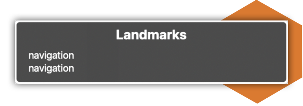
Landmarks help those using assistive technology orient themselves to a page and aids with navigation through page sections.
By not giving context to where the user is on a site they are presented with it only saying ‘navigation’. For example, instead the landmark should read ‘home page’, ‘contact us section’ etc.
Menu and skip-to-content accessibility issues impacting the user experience
There were no skip-to-content links across the platform. This presented the user with having to navigate through an entire menu on a screen-reader or keyboard to be able to navigate to their required content.
Menus were in an incorrect order for screen reader and keyboard users. Presenting the information below the last item of the main menu, again, meaning they would have to navigate through the entire menu to select information that should have been prevalent from the start.
Breadcrumb links used html buttons, making navigation through the site a difficulty. This meant that users would have to navigate to and select a different list for these elements to be read out by a screen reader.
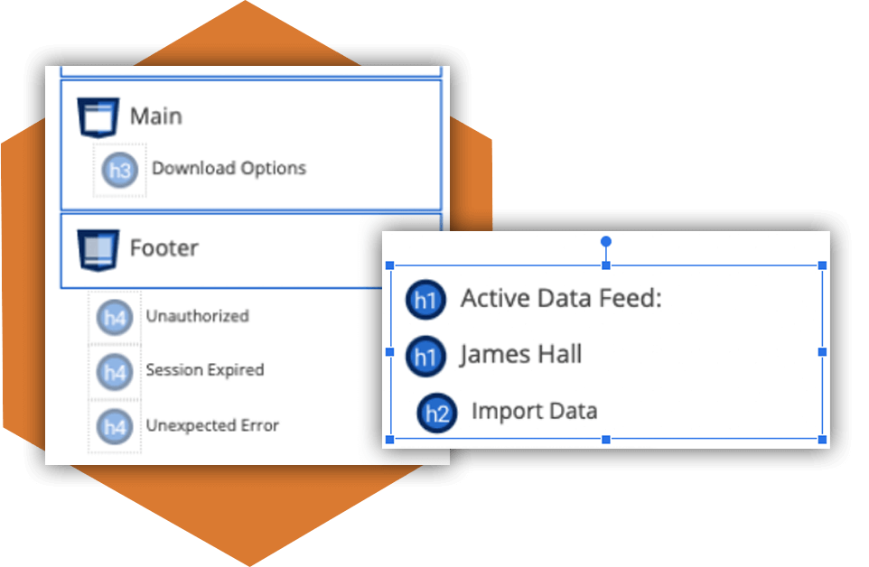
Poorly structured headings preventing site navigation
Many web pages contained no Heading 1, whilst others had multiple. This is the most important heading, as this corresponds with a page’s title. This gives users an indication of what page they are on and what the page is about.
Some H1 elements were images rather than actual text, preventing simplistic user-flow throughout the website.
Other pages skipped heading levels altogether, offered no context, or had different styling. All making navigation difficult for the user.
Website elements impeding navigation for assistive technology users
Those navigating with the use of a keyboard could tab outside of the website modal. This meant they could tab into page elements behind, not allowing them to be able to make a selection. Some other modals were inaccessible when using a keyboard. Screen reader users did not know when a modal box had loaded for them on screen to be able to access this service.
The use of accordions created problems for those using a keyboard to navigate through site elements. Accordion panels were not expanding, causing confusion for users as they were unaware where they were within an input field. When some did expand, they did not state that this action took place, offering no context to the user. Also, those using assistive technology could not tab from one accordion panel to the next without having to go through every field within each section.
Portfolio links for keyboard users were found to be challenging. Some could not be selected, others had hidden links or link text too small to be read by the user.
Users could not access checkboxes using assistive technology devices. These elements could not be read out to screen reader users or tabbed through.
Website carousels were uncontrollable for assistive technology users, preventing them from skipping the content.
Accessible calendar issues
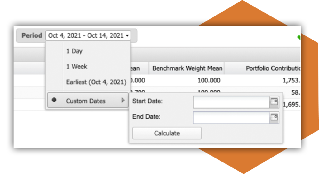
There were some keyboard traps within the site. When tabbing through a calendar element, selecting a date from a drop-down list or tabbing through a calendar was impossible for keyboard users.
Screen reader users could not access a date picker pop-up at all. This was due to the calendar requiring a visual aid of an arrow to select form fields.
A lack of site context causing a confusing user-journey
Many site elements had no context, causing issues for users.
This accessibility issue was on:
- Buttons
- Alternative text
- Input elements
- Hyperlinks
- Dropdown lists
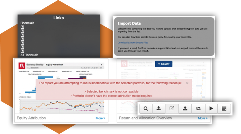
When selecting one of the above items, there was no description as to where the user was about to navigate or what action they would be taking. For example, when selecting a button, the screen reader simply states ‘button’ or ‘selected’, instead of stating what purpose or function the button has.
This is a visual representation of what a screen reader would read out to a visually impaired user. Whereas these should all be descriptive links for them to be able to navigate through:
The link text for each site report also just stated “More” when tabbing through them. Adding an ARIA label to give visually impaired users more information would improve this experience.
Poor website design elements impacting accessibility
All focusable elements on a website must have a visible change when hovered over, or active. This helps keyboard-only users to know what area they are currently selecting when tabbing through. The top site menu bar was unresponsive to this visible change.
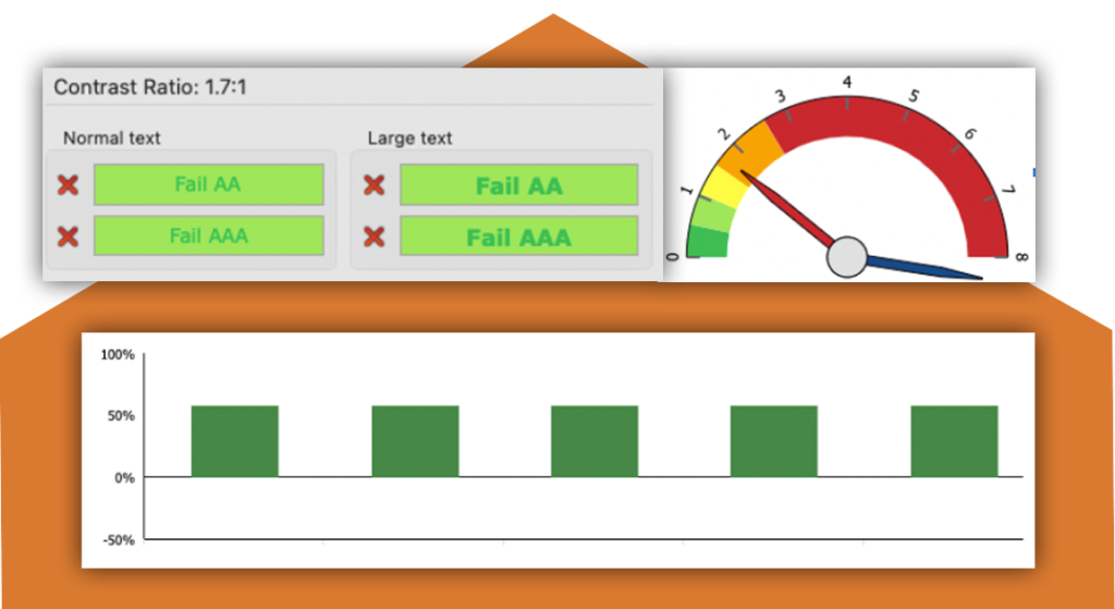
Though other website elements could detect items when hovered over by a mouse, the colour ratios used were insufficient for people with colour-blindness.
Input purposes should always be identifiable. Notification buttons displayed as icons instead of text. This visual only representation gives no context when read out for those accessing the site with a screen reader. This leaves users unaware of the meaning of the button.
An iframe containing a Google map was hidden from users due to the aria attribute being incorrect, preventing users from gathering information from the map.
Insufficient colour contrast ratios were found across many of the site areas, such as in:
- Sidebar menus
- Coverage boxes
- Multi-select choice boxes
- Alert banners.
This meant that many users would not be able to read the content within them.
Items like alert boxes should stand out for the user. With insufficient colour contrasts between the background and text colour, users would miss seeing important information or messages they might need to be aware of.
The problems with graphs, charts and tables
For assistive technology users, it was not possible to tab into any of the performance charts. This leads to users missing key information compared to users with a mouse, who can also receive additional information within the tooltips.
Many graphs and charts had the wrong colour contrast ratios. Meaning many users could not see the visual representation.
Some graphs offered no contextual information for users to understand what the graph represents.
Screen reader users struggled to access the tables presented on the site. Though they were able to access the table, many skipped key information and just read out the information in the table footer. Missing the important data that the users might require.
Table buttons located at the end of each row also didn’t contain any text. This gave no indication to the user what its function was.
Accessibility audit testing impact and results
Our comprehensive accessibility report handover, provided a clear roadmap of accessibility changes required to meet with 508 standards.

HeX demonstrated that seemingly small errors can have a large impact on their users.
Our detailed report gave screenshots and links with clear walkthroughs on where the site had been presenting digital barriers.
After our assessment, HeX fed back the site errors via a video conference call. In this meeting, we provided the Confluence team with a demonstration on the use of assistive technology software and devices. HeX demonstrated that seemingly small errors can have a large impact on their users.
These demonstrations have helped their team in gaining a deeper understanding on the importance of user testing. Upskilling the team in carrying out embedding accessible features and best practices into their site in the future.
Once these accessibility barriers are addressed, everyone will be able to navigate through their website with ease and gain access to the important information and data they would have been missing out on previously.
More case studies about accessibility audit testing
University of Winchester
The University of Winchester approached HeX Productions in need of an accessibility audit of their website, to assess problems faced by disabled users. As well as creation of an accessibility statement for their site.
Queen Mary University of London
QMUL are strong diversity advocates, who want to improve lives through academic excellence. This is why, they approached our team in need of website accessibility audit testing to ensure their website is accessible for everyone.