Case study brief: Designing a striking and accessible branding for SMC Design
SMC Design is a global, modern engineering company established in 1994. A company dedicated to providing high quality design, simulation and product development services for the engineering industry. Their clients include leading automotive and aerospace giants such as Mercedes and Rolls Royce.
SMC Design approached HeX with a need to revitalise their outdated brand and wanted a fresh new website to showcase their services. SMC understood that they needed to stand out in a competitive market, and knew a modern brand and well-built website would be key to show off some of their innovative and unique tooling design commissions. Their current brand lacked visual appeal, and faded into the background amongst their competitors. The engineering industry calls for modernity, stylish and sleek lines, with a strong reliable image and the brand had to represent that.
HeX's extensive modern design experience made this case study unique
SMC is a family established business which denotes an emotional investment in the way the company is perceived. This meant that getting the right look was even more important to the directors.
The branding needed to be delivered in an iterative process, ensuring the SMC team had plenty of opportunity to give feedback on suggested concepts. Creating a brand that fit seamlessly with their vision of being a modern, fast paced, continually improving, engineered design company.
The colours, fonts and logo styling were meticulously defined from a range of options, tailoring every line to their exacting specification.
Accessible branding design activities
Assessing the market to create stand-out brand design
SMC is a global engineering company, offering robotic simulation, factory layout design, ergonomics, manufacturing process engineering to key top class global companies in aerospace and automotive industries. In a fast-paced industry, like robotics, being up-to-date is key to brand success.
SMC Design’s previous branding did not accurately communicate the groundbreaking work that they are involved in – instead, merging into the sea of competitors. With SMC having worked with multi-million pound clients such as BMW, Mercedes, General Motors, Aston Martin, Land Rover and many other global manufacturing brands, it was vital for them to communicate their stature in the industry and capitalise on continued success.
With a history of upscaling brands, HeX was the obvious choice for a website and branding service. Having worked with the creation of branding for companies such as alternative education company Enstruct, health and social care training organisation Matter UK, and our own accessibility-focused tech meetup, Accessibility Nottingham, our successes were clear.
Assessing the market, HeX ascertained what brand strategies competitor’s were using, helping to emphasise the need for SMC to modernise. Having spoken to the key stakeholders within SMC, HeX were to ideate a design that fit the vision of the brand and that would fit well in the market. SMC’s core values are to provide high quality products, dedicating to developing and investing in the latest technology. These were key elements we wanted to highlight through the overarching brand identity.
Using vibrant and eye-catching colours and a pronounced font was the key to creating a truly stand-out brand that could stand the test of time.
An iterative approach to the branding process
To ensure that we maintained SMC Design’s vision, the branding process was delivered in iterative phases, fitting the expectation of the client. Each phase was delivered and discussed with top level executives at SMC, ensuring the new brand would be championed from the top-down. Each design phase allowed SMC to communicate which design ideas they liked and which they believed fit with the company ethos the best.
From the font to the logo, each design consideration was done collaboratively, and based upon the market assessment. 97% of top entrepreneurs believe collaboration with teams, both in house and outsourced are vital to success, emphasising the importance of working collaboratively with SMC to deliver this project.
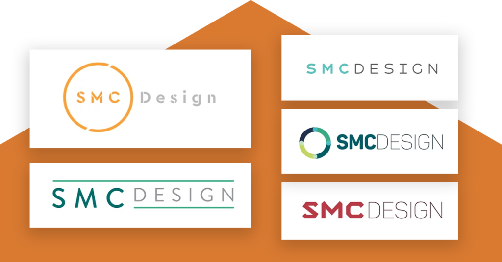
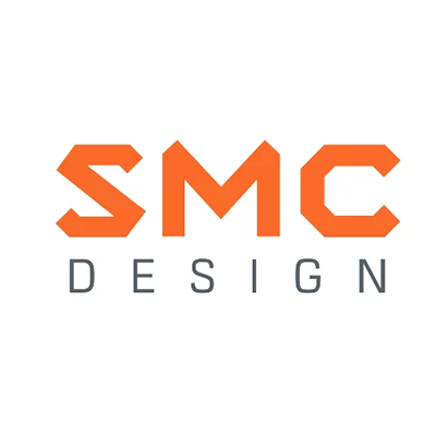
Choosing the right logo to compliment the brand, HeX created a range of logos, using a variety of colours and styles. The logo was designed to be versatile; looking striking digitally and on print. The concept designs all communicated the engineering sector of SMC.
In just 400 milliseconds the visual elements of a logo design are processed in the visual cortex of our brains. It was essential the design of SMC’s logo was simple, eye-catching and recognisable.
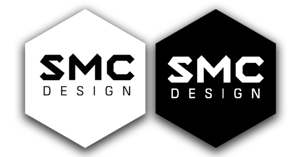
The logos took inspiration from SMC’s technical robotics layouts, using straight lines and a polished finish. Each letter of the ‘SMC’ imitates the look of a robotic arm, with the word ‘design’ being in a complimentary font below it. This gave SMC a greater understanding of how their logo would look and how the brand could add life to their presentations and marketing material..
It was essential the logo stood out in a muted and corporate crowd, whilst retaining the professionalism of SMC.
Making a brand that stands out
The brand had to be reproduced across a variety of digital, print and three dimensional applications. HeX devised a series of colour palettes that would complement the logo.
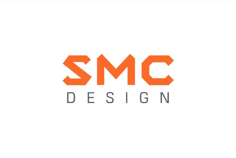
SMC chose a rich orange colour as their primary colour based on HeX’s recommendations. To compliment the primary colour, a grey and a darker orange were introduced. The chosen colour reflected the colouration of some of the robotic arms simulated by SMC. This further communicated their services within the brand
Orange added additional flair to the branding, making it stand out. The secondary grey allowed for the palette to remain professional looking and sleek in the market.
More than 35% of brands use the colour blue in their logo. Greyscale is used by 23% of top brands. It was vital for SMC to stand out from their competition who were also using greys and blues. In psychology, orange represents rejuvenation, joy and creativity. Creativity in particular is something SMC pride themselves on.
Creating brand guidelines for a professional approach
HeX created a 24-page brand guidelines for SMC, ensuring that once the brand was handed to the client they would have the confidence to implement this into promotional print and digital material.
Brand guidelines are the key to a cohesive and consistent styling for any company. According to Forbes, consistent multi-channel branding increases revenues by up to 23%.
The guidelines created ensured that the client could comfortably use the colour palette, typography and suitable imagery to complement the designs. Once SMC had received the brand guideline document, HeX was on hand to be able to explain any of the applications to the team at SMC.
SMC now has a distinct brand that stands out amongst a sea of global competitors. Brand guidelines have given SMC the confidence that their brand can flow through their entire business from pre-sales to aftersales giving them the polished expert feel from the second they are in front of their clients, leaving a lasting impression of their expertise. SMC were presented with mock-ups of how their brand would transfer to business stationery, printed and digital presentations to show how they would create a new and lasting impression.
More case studies about accessible design
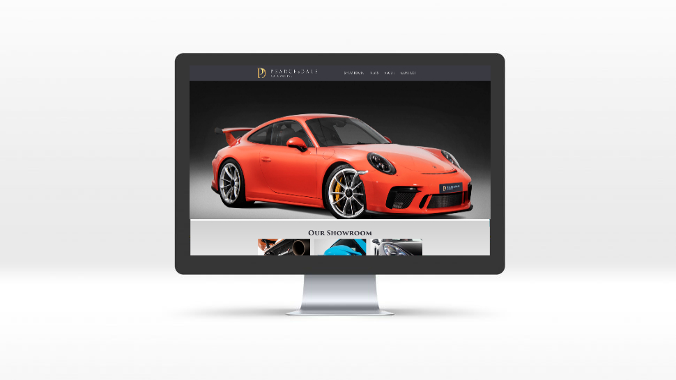
Pearce and Dale
Pearce and Dale needed an online platform to be able to showcase and list vehicles for sale in order to attract a wider audience.
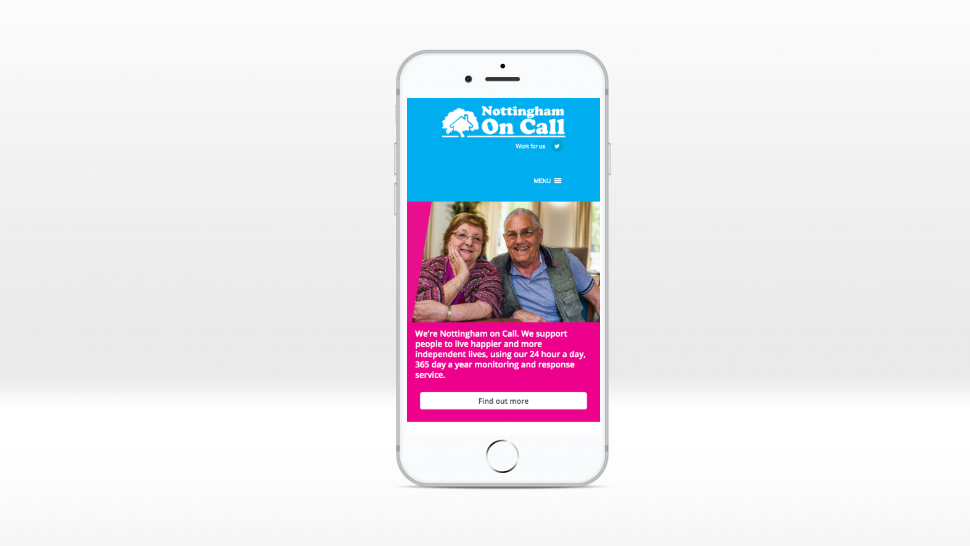
Nottingham on Call
We created a sleek look and feel that was accessible and easy to understand for all of visitors along with a simple editor tools.