In this blog, we are looking into ways that organisations can help to reduce these feelings for users online.
We’ve all encountered websites which have elements that timeout, have unclear directions, or forms that aren’t user-friendly. Even items such as sales tactics with “there’s only one room left” flashing up on your screen, to try and panic you into reaching for that credit card. For most of us, these can be frustrating. For people with anxiety, these features can have a much more severe impact; inducing feelings of unease, worry, and fear.

What is anxiety?
Anxiety is a common emotion in all of us. It’s likely that we’ve all experienced anxious feelings at some time or another. This may be due to exam pressures, money worries, starting a new job, or other big events in life. Sometimes these feelings can get out of control, leading to them becoming a mental health problem. A problem that can deeply affect someone’s quality of life.
View Mental Health UK’s video on what an anxiety disorder is:
Why organisations need to make digital anxiety considerations

Most of us would try and avoid situations that have a negative effect on ourselves and on our mental health. Sadly, many people don’t have that option. This being said, if you went onto a website that brought these feelings to fruition, you’d most likely not return to put yourself through the same experience again. This is likely the case if your site has certain aspects that trigger feelings of anxiety. With there being over 8 million people in the UK with anxiety disorders, that’s a lot of custom you’d be losing! Unfortunately, some websites can’t be avoided; such as local government websites, where there is only one route to the information and services that people require.
I’m sure no one would want their online content to intentionally have a detrimental effect on their users. Many may not even realise the harm that certain site elements can cause. Whilst others may be unaware of what fixes can be made to eradicate feelings of anxiety when online.
Below, we are going to talk you through some small changes that can make a big difference for around 1-in-10 of your site visitors.
Five Ways to Design for users with Anxiety
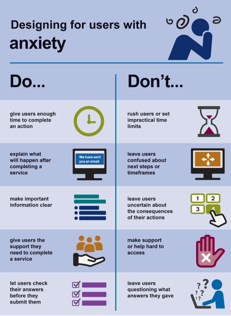
Give users enough time to complete actions

Nobody likes being rushed, and let’s face it, there really isn’t a need to do so when someone is simply browsing through a website.
People with anxiety may take slightly longer to complete something. This is because they may be cautious about getting something wrong, such as filling in an online form or completing a booking.
Site elements, such as page timeouts, can make it impossible for users to complete online actions. Features like countdown timers, such as two-factor authentication (2FA) or at the end of videos to automatically play the next episode, can also hurry users into making snap decisions.
A simple way to aid users with anxiety, is to give the user the ability to extend or turn off time limits. Better still, why not remove timeouts altogether?
Don’t leave users confused about the next steps or timeframes

It’s important to let users know what will happen after they complete an action. For example, if someone is applying for a job online, let them know what the next steps will be in the recruitment process and how long it will be until they will hear a response.
Let users know before they make a final action that this is the last stage before submitting information. This will allow for time to check over inputted information and make changes if necessary.
Make sure your information is clear

Make your content clear and simple for your users to navigate through and understand.
You can do so by:
- Keeping a basic and consistent layout throughout web pages.
- Making your site navigation visible and user-friendly.
- Using clear heading structures.
- Giving alternative formats.
- Using strong taxonomy to steer users to the source of information they need.
- Providing detailed instructions to aid with user input.
- Giving warnings about the consequences of actions being taken.
- Writing using inclusive language. Skipping jargon, writing abbreviations in full, and avoiding complex wording.
It is also helpful to make sure that if error messages occur, they are clear for the user. These should explain why the error has happened and what can be done to remedy it. Giving predictability and empowerment for your users.
Remove distractions

Pop-ups, such as an advert or survey that automatically opens across a screen, can cause anxiety for some users. Unfortunately, these are found are on many websites nowadays. But, did you know that WCAG states that you shouldn’t use these features without giving an explicit alert beforehand? There are now many ways to create eye-catching call-to-action boxes on sites, so remove your pop-ups and embed them on the page itself instead.
Features which automatically play can also create a sense of panic in some users. So, it’s important to give your visitors control of the content they wish to view, when they want to view it.

Don’t make support or help hard to access
It’s vital to give users access to support. Users who may be struggling to complete an action may need some extra assistance to do so. Therefore, clear signposting to contact methods should be readily available throughout web pages.
Untangle the web of anxiety and support your site visitors by creating lasting change. Download the UK Government’s handy poster, to act as a reminder next time you are creating online content.

Support for people with anxiety
It’s never ‘just’ anxiety. If you need help on how to help reduce feelings of anxiety, visit one of the websites below for an array of really useful advice:
- NHS Inform Self-help guide
- Mind – Anxiety and panic attacks
- Mental Health Foundation
- Young minds – anxiety
