The design of digital platforms for people who are colour blind is often overlooked, even though 4.5% of the population need adjustments to be able to interact with online content. This blog looks into ways to use inclusive colours to enable digital accessibility.

Who is affected by colour blindness?
Colour blindness is more common than you may think, with 300 million people across the world having some form of colour deficiency.
1-in-12 males are colour blind, compared to only 1-in-200 females who have the condition. Usually, colour blindness is genetic, although some people may become colour-blind as a result of a disease, through ageing, or from the use of certain medications and drugs.
There are different types of colour blindness, but fundamentally, it comes down to people not being able to clearly distinguish a colour or getting colours mixed up, meaning they can’t differentiate between them.
The advantages of designing platforms with inclusive colours
There are many best accessibility practices when it comes to the use of colour, which ultimately will enhance the user experience for everyone. This is especially the case for people with low vision or colour blindness. Websites and apps that are designed with inclusive colours at the forefront give these users the ability to be able to navigate, interact, and purchase products from an online platform, which they may not be able to do otherwise. In turn, you will gain a greater reach and increase custom.
Web Content Accessibility Guidelines (WCAG) and compliance for colour-blind users
Web Content Accessibility Guidelines (WCAG) have three rules that need to be taken into consideration in order for your platform to be compliant and accessible for colour-blind users.
WCAG success criterion:
- 1.4.1 Use of Colour: You need to ensure that colour is not used as the only visual means of conveying information.
- 1.1.1 Non-Text Content: Provide a text alternative for non-text content to give an equivalent purpose.
- 1.4.3 Contrast (Minimum): The visual presentation of text and images of text needs to have a contrast ratio of at least 4.5:1.
We’ll be looking more into these in the following section.
Colour combinations to avoid using
There’s a common misconception that colour-blind people only struggle to see green and red colour combinations. This is false. Though it’s still best to avoid this combination, there are other colours that you should avoid using together, such as:

- green and brown
- blue and purple
- green and blue
- light green and yellow
- blue and grey
- green and grey
- green and black
This should be considered on background/foreground colours and on site elements such as buttons, navigation, headings, focus indicators, call-to-action boxes, and any media files.
Using sufficient colour contrast ratios
Even if you have chosen a colour combination that is user-friendly, it’s still really important to check that colour contrast ratios are at a sufficient level. This basically means that there is a clear difference between background and foreground colours.
Think about if someone presented their content with a yellow font on a white background. Any users would struggle to see this. Well, this could be a similar experience you’ll be providing if contrast levels aren’t checked.
Contrast ratios need to be at least 4.5:1 for normal text and 3:1 for large text (which is defined typically as 14 points or larger).
For example:
14pt text pass
18 pt text pass
14pt text fail
18 pt text fail
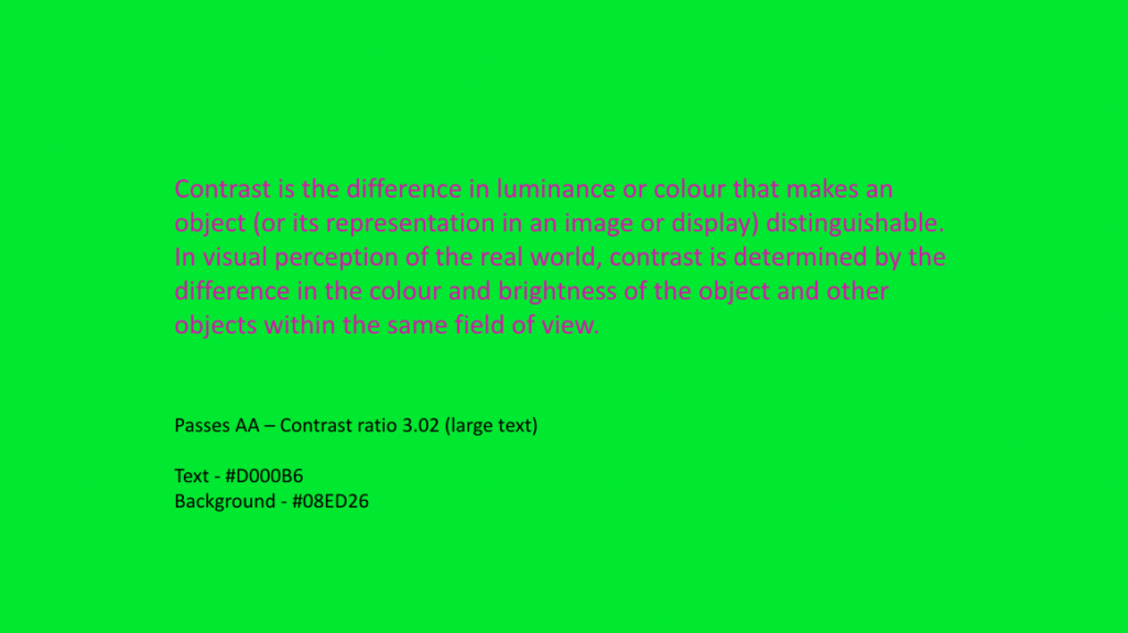
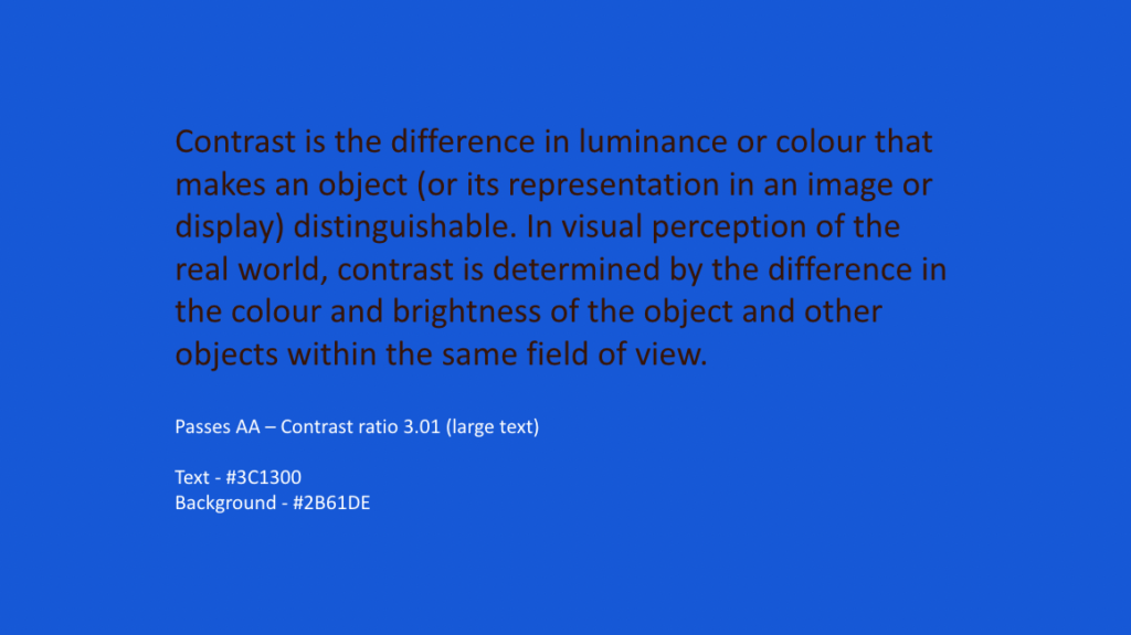
It’s important to take into consideration that just because a colour palette passes a ratio check, it doesn’t mean that it should be used in production, as very high contrast ratios can be jarring on the eye or still difficult to read like these examples below, which passed the test. So it’s important to use your judgement as well:
Do not use colour to display a meaning
As colour-blind users may not be able to see certain shades of colour, it’s crucial not to replace words with colour.
A poor example:
Dangerous plants are in red
Orchid
Foxglove
Money Tree
A good example:
Dangerous plants are highlighted
Orchid
Foxglove (poisonous)
Money Tree
Instead, use meaningful text labels or icons.
Avoid using text overlaid on busy backgrounds
There would be no point in having text on your website that isn’t readable for your users. As you can see from the example below, by making simple adjustments, you can actually make your content more user-friendly for everyone.
Bad example:

Better example:

Good example:

Using a large, heavy, and clear typeface also aids with your content’s readability.
Top tip for developers: If necessary, use a gradient or an absolutely positioned <div> with a background colour. You could then try using some of the CSS Filter properties, such as contrast(), opacity() or blur() to ensure your text is legible and compliant.
Ensure your links are visible
Some websites don’t have underlined links, which makes it even more challenging for users if only a colour is presented.
Where possible:

- Make sure that your hyperlinks are underlined.
- Use descriptive text as to where the user will be directed as an additional prompt. This will also support blind users and people with low vision.
- Check that the chosen colour combination is user-friendly for colour-blind people.
- Check the contrast ratio is compliant and clearly stands out from the other text.
The need for descriptive text
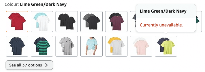
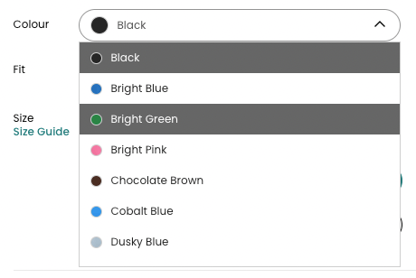
If items such as colour pickers when purchasing clothing aren’t labelled correctly, it can leave users unaware as to what colour they are selecting when ordering products such as clothing. This may result in them choosing not to continue with placing that order.
Adding a description next to the colour or a text label when hovered over will remove this online barrier. The same goes for if the actual names of colours is used, such as ‘carmine’ instead of describing the colour, e.g. ‘deep red’.
Implementing inclusive charts and graphs
Often, charts and graphs are colour coded and even with the use of a legend, they don’t always provide clarity as to what information is trying to be conveyed.
Take a look at the example below to see how someone with deuteranopia would view these same graphs. As you can see, there isn’t a lot of difference differentiating between red and orange colours.

Deuteranopia:

To aid with accessibility:
- Clearly labelling each section will help to give context.
- Where possible, using patterns will help to give clarity.
Accessible forms and error messages
Quite often, if an action isn’t completed correctly on a form element, the error is highlighted by a colour. I’m sure you can already guess the problem with this by now. For example, if green were used to say what was completed correctly and red highlighted the error, many people wouldn’t be able to distinguish which bits need to be amended. The use of an icon or text can eliminate this problem.
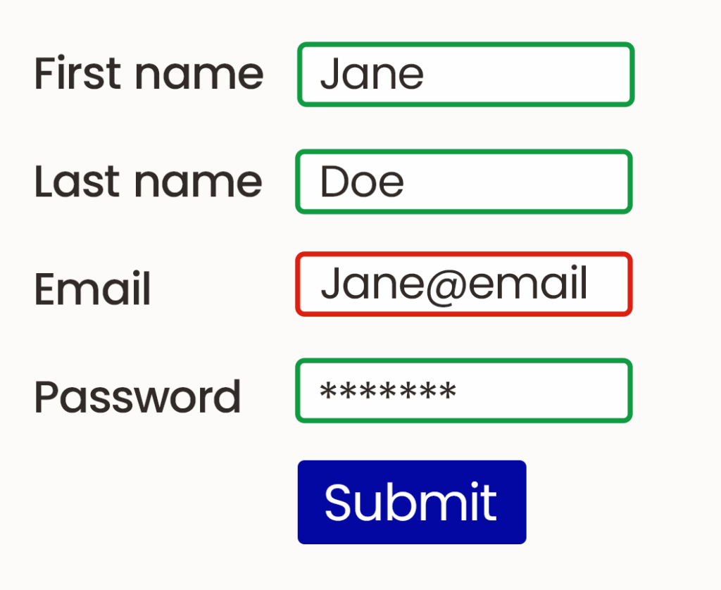
Bad form example:
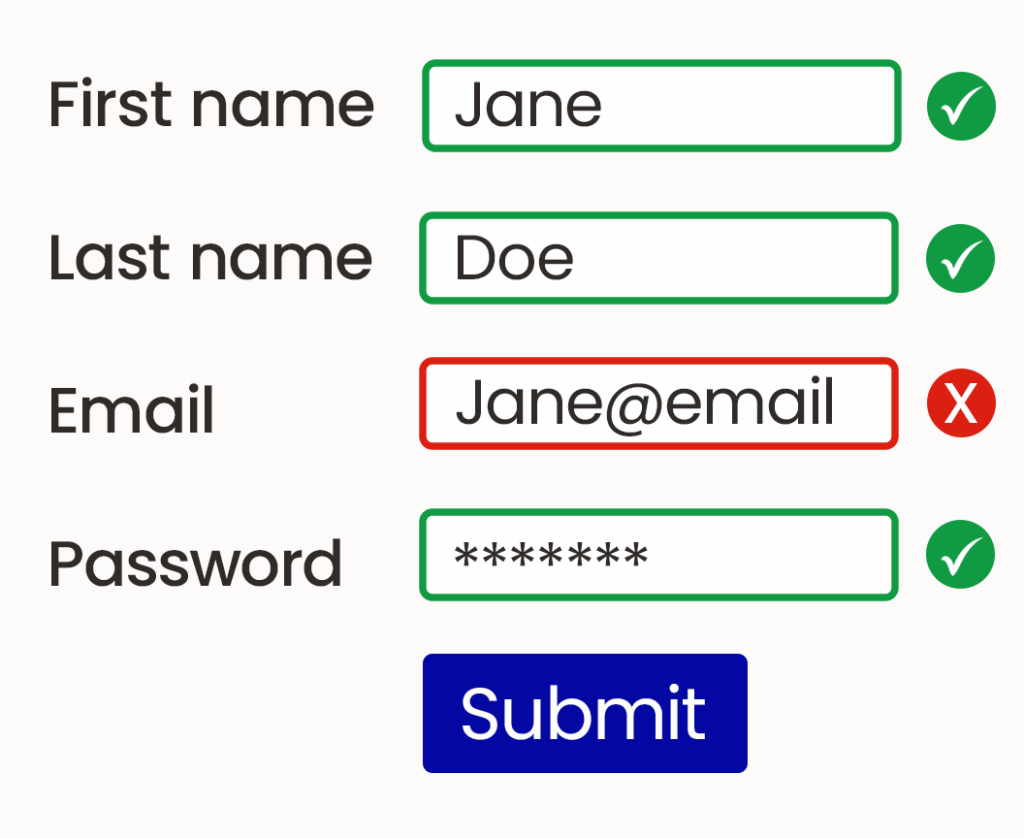
Better form example:
Form placeholders without a label may also cause problems for users, as quite often, they are pale in contrast. However, increasing the contrast would then make it difficult to tell the difference between placeholder text and that which has been entered by the user. So, using adequate labels with sufficient contrast is always advisable.
Digital accessibility for users with colour blindness further considerations and tools
- As well as ensuring your background and text colours meet the WCAG 2.1 contrast ratios, ensure that any button states (:hover, :active & :focus) are also valid.
- If you use SCSS, make use of the colour functions to manipulate your primary and secondary colours so they can meet the required contrast ratios.
- Remember text within logos is exempt from WCAG 2.1, but your brand palette colours should still meet the correct contrast ratios.
- Use Coolors to generate colour schemes and toggle the Colour Blindness option to see what users might see.
- If you have an outline around any text (such as using CSS text-stroke property), then the ratio will be checked against the text outline colour and the background colour.
- Icons are included in the WCAG 2.1 guidelines should have a minimum contrast ratio of 3:1.
- Check pages of your website using the WAVE Evaluation Chrome extension to check contrast ratios amongst other WCAG guidelines.
Need help with ensuring your platform is accessible for people who are colour blind?
Our accessibility experts are happy to offer advice if you aren’t sure if your website or app is accessible. You can get in touch and have a chat with the team or take a free website accessibility health check to get started.