Case study brief: Accessible web design and branding for Ashfield District Council
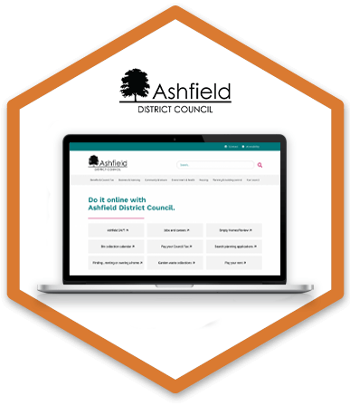
HeX worked with Ashfield District Council, in Nottinghamshire, to assist in the development of a new accessible brand and website that was fit for purpose for a digital-first local authority.
Recognising the importance of accessibility, Ashfield enlisted the help of HeX, as accessibility subject matter experts, to help guide the creation of a user-first website.
Councillors at Ashfield had personal experience of accessibility and wanted their new website to reflect this. As a public sector body, Ashfield knew that they needed to comply with the Public Sector Accessibility Legislation, therefore, it was essential that they were assessed by a disabled user group to help gain a recognised accreditation, ensuring the site met with WCAG requirements.
HeX's experience working with local authorities made this case study unique
Hex has vast experience in working with public sector organisations. Working with a wide range of local authorities our team knew exactly how to assist Ashfield District Council in becoming accessible.
The team were keen to work on this project and proud to work with another council to help drive forward accessibility, having already worked with:
- South Lakeland District Council
- Rushcliffe Borough Council
- Broxtowe Borough Council
- West of England Combined Authority
- Newark and Sherwood District Council
Web development activities delivered
- Website design work
- Web development, including the creation of bespoke site elements
- Integration of Application Programming Interfaces (API)
- Delivering Accessibility Content and Editor Training
- Project management and accessibility consultancy
The importance of iterative wireframing reviews
HeX was responsible for the branding and graphic design of Ashfield District Council’s new website. With our team being subject matter experts for accessibility, we implemented an accessible code that presented function and features with usability at the forefront – working alongside the developers, to ensure accessibility was built into every step.
Ashfield knew that accessibility should be built into the beginning of every project, including at the wireframe stage.
A wireframe is a line drawing of how a site’s elements will be placed, before any visual design has been implemented. This means that there is no colour or effects added to the wireframe, so that it can be seen and used in its most simplistic form. This allows designers and developers to understand the intention of a website’s features and how it will work.
Wireframes can also be built in HTML so that structure and form can be worked on before additional styling is added. This enables a fast moving agile build process.
For this project, the wireframes were approached hand-in-hand, designed by HeX and built in HTML, by October24. We worked side-by-side with a design, develop, test, feedback loop flowing consistently throughout the project to avoid any gaps or downtime.
When wireframes are built in the browser, by coding it in HTML, it allows everyone in the creation process to interact with the site, giving it a realistic sense of how the website may feel to navigate. Interactive prototypes help to give an understanding of the website’s elements, such as what buttons and hover states would look like in both their active and inactive states.
Resolving menu and navigation accessibility issues

HeX made several suggestions in meetings with Ashfield and the wider team, regarding navigation, page layouts and interactivity. In particular, the proposed menu and navigation systems were highlighted as causing potential obstacles and confusion for disabled users. With the commitment to accessibility from both parties being clear, changes were made quickly and efficiently.
We were able to use our expertise in accessible content design and development to support our suggestions, allowing teams to understand what obstacles would be posed for assistive technology users, because of our own extensive experience of using assistive technology to demonstrate websites to our clients.
Suggesting accessible alternatives to multiple sidebar navigation elements
The initial wireframes included a left sidebar for internal navigation and a right sidebar for links to resources for either internal or external use.
It was clear to our accessibility specialists that this method of implementation would not be fit for users who were neurodiverse and expected navigation to be simple and clear.
The recommendations that we made involved reducing the sidebars to just one per page, rather than the initial two, and taking a ⅓ to ⅔ page split as research recommends. The links and resources sidebar was removed and a dedicated area was created for resources. This gives them a clearer identity and helps with user flow, providing clear and consistent navigation objects.
Creating a solid brand and design to fit the vision of the council
Before the design phase went ahead, Ashfield did not have brand guidelines or consistent typeface. The only material that we had to go on, was from their website, which was red and white in colour and contained varied font types and sizes.
After speaking with their Communications Team, they were able to supply our designers with some proposed colours, allowing us to brighten up the website. The multiple colours were introduced into the palette, to move away from the old red, grey and white colours that were on the previous branding.
Ashfield knew they wanted additional colours building into the website, so that it looked sharp and modern. After discussions, it was decided to implement these colours into the design subtly, as to not distract the user from the information they need.
We also decided to avoid using block colours. Taking inspiration from the GOV.UK design patterns, the overall design needed to be simple to use. Using block colours across the site would have taken away from the content of the site. Some of the colours in the colour palette did not meet the minimum contrast ratios, so were amended slightly to fit with contrast requirements.
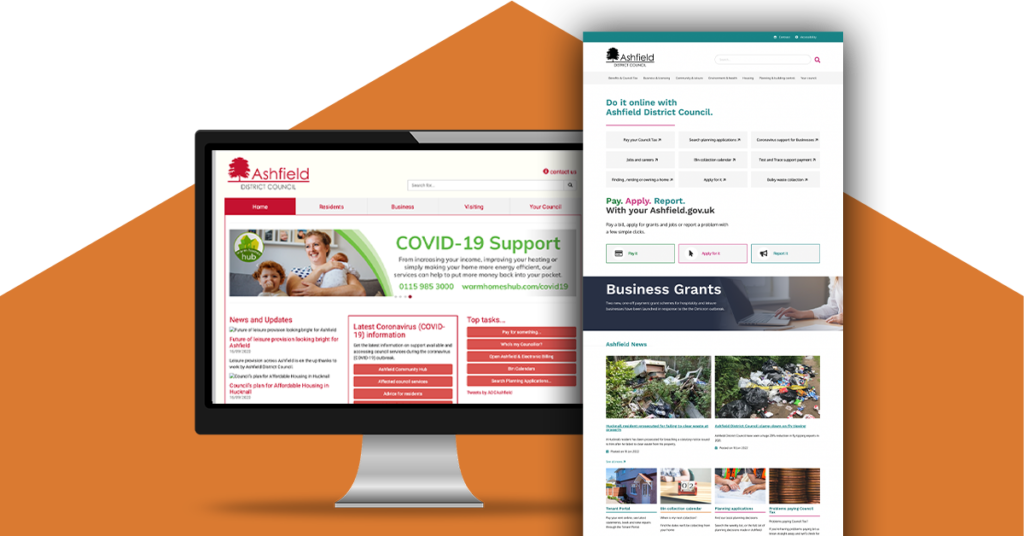
Prioritising user flow by focusing on the homepage designs and building outward
At the beginning, the wireframing and design teams focused on the homepage of the website, understanding that this would be the first impression for many users. A solid homepage would also shape the user flow throughout the rest of the site and signpost to relevant services.
The website was designed to be sleek and simplistic, allowing plenty of white space, so as to not cause unnecessary confusion or distraction for users. A number of accent colours were used, but the site predominantly features white and black.
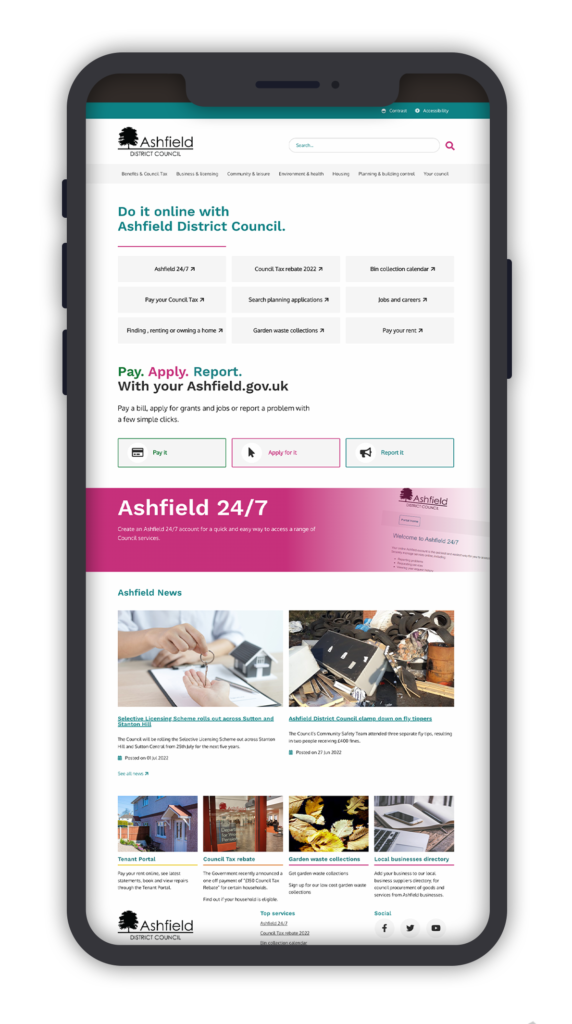
From research and discussions with the content strategist, we understood that the website needed to be as easy as possible to use, and the key user journey had to be prominent – so we created easy visual clues, using icons for each key services of “Pay”, “Apply” and “Report”.
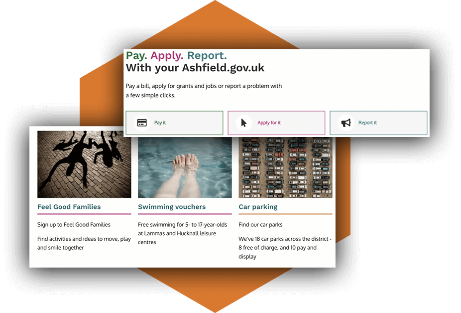
Icons were also designed to be used on external links, so that it was clear to users that they were clicking on a link that would take them to an external site.
A simple to use menu on the front page allowed visitors to easily access the services they required without difficulty. HeX designers created numerous versions of the home page, allowing Ashfield to choose how the news and events sections could be implemented into it.
Due to the Coronavirus pandemic, events were not a priority for the Council at the time of the build, but as normality returns, we wanted to be able to demonstrate how events would be displayed on the homepage, allowing us to future proof the website design.
Ensuring content cross-site is displayed effectively by implementing pattern libraries
Pattern libraries are designed and coded elements of a website that can be implemented across the site. These ‘patterns’ are snippets of code that act like building blocks that you can add to a website where they are needed. Having a pattern library keeps a consistent design and codebase, much-like having brand guidelines for design. If a new developer picked up a project with a pattern library, they would know exactly how an item, such as a button, would need to look and function.
Templating is another form of maintaining consistency. Providing comprehensive page templates or patterns, means that content implementation can remain consistent throughout the site and a content strategy keeps its shape and performs as expected.
Providing accessibility consultancy on the development phase of a project
HeX’s responsibility during the development phase of the build was to consult on accessibility, ensuring that the developers kept accessibility in mind throughout the process. This involved periodic testing of the navigation flow as the site was built. This testing ensured that users would be able to navigate through the website as simply as possible.
This periodic view of accessibility testing allowed the site to progress accessibly throughout the build. Retroactive fixes can often take longer in projects than proactive fixes.
We tested developed pages weekly to ensure that accessibility was being implemented effectively. The site was being built in Umbraco, which HeX have had experience working with in the past, with Broxtowe Borough Council.
Throughout the development, HeX made recommendations of where ARIA should be implemented to make it easier for screen reader users to navigate the site. These recommendations were followed up by assistive technology demonstrations by HeX, so that the developers could understand why they were implementing ARIA labels and how they would assist them.
ARIA labels help screen readers to read elements, such as form fields and buttons, out to their users. These labels are hidden to someone that is not using a screen reader, but are designed to apply additional context to elements for screen reader users only.
One particular implementation of effective ARIA labels was on the “Pay”, “Apply” and “Report” buttons. Standalone, these buttons would not be descriptive enough for screen reader users, so by adding ARIA descriptions to these buttons it provides screen reader users with direct information, for example on what they would be paying specifically for.
Industry leading redevelopment of a difficult service offering
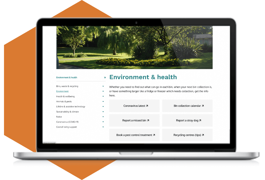
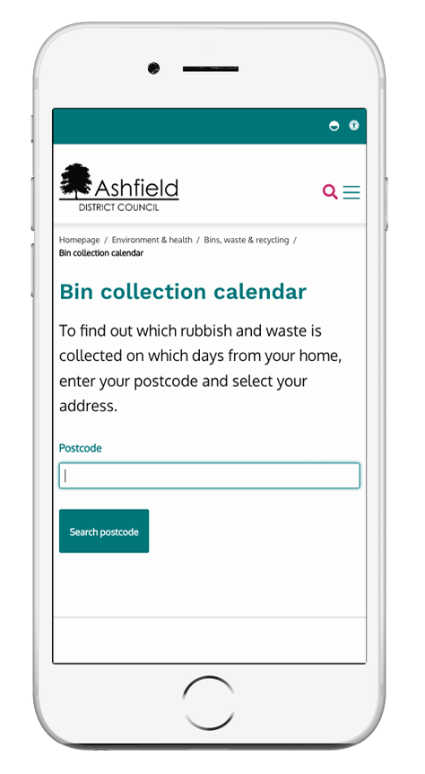
One of the most used services on a local authority’s website is bin collection information.
We had the opportunity to review Ashfield’s bin collection calendar and other key services, in order to ensure that they were accessible. Ashfield’s bin calendar was a specific area of interest, due to the complexity related to making this an accessible feature. Special attention was given to the logic and customer journey, where the service allows a user to enter their postcode, select their address and access the list of bin collection dates in a handy table. This also allows integration with a user’s digital calendar.
Due to the advanced nature of this calendar service, we reviewed and ensured that this is now accessible for all users.
Recommending accessible third-party systems
As accessibility specialists, HeX were also able to recommend form packages that could be implemented into the site. The ones chosen by Ashfield and the developers contained some potential blockers for disabled users.
Being able to recommend accessible form solutions for the website, meant that users would be able to complete form sign-ups and applications without experiencing issues. Consulting on this aspect of the build allowed Ashfield to challenge their current forms supplier and has given them the opportunity to fix the obstacles associated with their packages.
Creating an accessible website that is WCAG compliant
As well as consultation on the development phase of the build, HeX were also on hand when content was being implemented into the site. The content implementation was taking place alongside designing and development. This allowed for a streamlined creation of content to maximise the ease of the user’s journey.
During content creation, the content designer was able to approach us for advice or guidance. One of the important content strategies that was discussed throughout, was external and internal links. Links that pointed externally, to other websites not within the Ashfield domain, were labelled with a small icon indicating that they were external links. Supporting documentation and these external links were originally intended to be visible on a right-hand sidebar. This was changed and the content was placed in small boxes below the content.
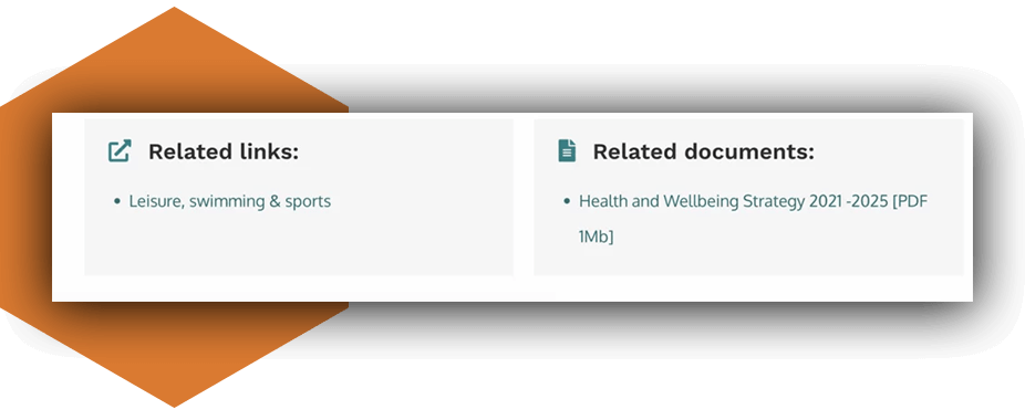
This approach was implemented consistently across the site, allowing for users to access supporting documentation and links easily. As part of the process, we also reviewed the content guide and the content map to ensure that accessibility had been built into the content process.
The content designer of the project had done a phenomenal job in ensuring the content was accessible and clear to as many users as possible. It was clear that the content was designed with a strategy to make the user journey more streamlined.
Creating an Accessibility Statement
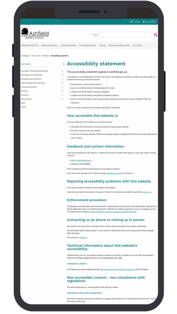
HeX also advised Ashfield on the creation of the Accessibility Statement for their website. This meant ensuring that it met the requirements laid out in the advice published from the Government Digital Service.
This involved ensuring that the legal wording for accessibility compliance was present on the statement, as well as the ongoing process of ensuring the site remains accessible, including periodic accessibility testing.
We also advised Ashfield where to place necessary information into their Accessibility Statement, including the contact details of individuals who are responsible for the progression and management of accessibility within the local authority going forwards.
User testing to ensure WCAG compliance
Once the content implementation and development was complete, we sent the website off to our partners at Shaw Trust Accessibility Services. Accessibility Services employ a range of disabled user testers to test websites. These include assistive technology users, such as screen readers, voice navigation and keyboard only users. This gave Ashfield a detailed report on how accessible their website was in the opinion of disabled user testers.
Automated testing only brings up 30% of errors on a site, so the involvement of the Shaw Trust Accessibility Services was invaluable. Shaw Trust’s report detailed any obstacles that were experienced on the website. This allowed developers to make changes as per the advice of HeX experts. All fixes detailed in the report were minor and remediated quickly due to the fact that it was a consistent consideration throughout the process.
Shaw Trust Accessibility Services supplied Ashfield with an accreditation to say their website had been tested and certified as accessible. Once complete, a handover meeting was organised, so that Ashfield could assume control of their website.
HeX and October24 remained on board throughout the process to ensure that go-live was as smooth as possible. Ashfield now has an accessible website that they can be proud of.
Meeting the objectives of the project to ensure a digital-first solution for users
Thanks to the continued review and iterative stages of the project, Ashfield now has a website that has accessibility built in from the beginning.

Since going live, page views of the Ashfield site are now up by 13%.
The primary objective of this project was to deliver a more efficient, reliable and consistent digital service, through improving the customer’s experience and encouraging the use of “self-serve” options, rather than visiting or calling the contact centre.
Prior to the project commencement, Ashfield identified that the previous website contained poor user journey optimisation, outdated designs and poor accessibility. Once completed, we were able to help deliver all of the solutions that Ashfield required.
Since steering users away from the contact us section and by providing accessible self-serve options, there has been a significant improvement in journey flows. This has resulted in face-to-face appointments and phone calls decreasing by more than 50%, which equates to around 3,300 less page visits per month and call volume data displays a potential saving of around £8,250 per month.
The most searched for content, pre-launch, was for the Planning section of the website. Searches for this area are down by an impressive 90%, demonstrating that users can now effectively navigate directly to this section, without the need for a search facility.
Analytics tracking showed that the amount of traffic to the contact page, from users who had accessed information elsewhere before resorting to visiting the Contact Us page, (suggesting that they didn’t find what they needed on the site) is down from 28% to 14%. Users who attempted a search via the site search function, and then resorted to contact us are down by 66% in comparison to the old website.
These statistics suggest that a significant percentage of website visitors, who were previously failing to self-serve (pre-relaunch), are now able to do so.
More case studies about accessible web development
Joshua Hayday Helping Hand Trust
The strategic communications agency, Bulletin, approached HeX Productions for our accessibility expertise. Our team set to work developing an accessible website for one of their clients.
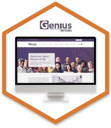
Genius Within
Due to the large number of Genius Within’s users being neurodivergent they required a re-design and re-development of their website, with a user-focused approach.