Online shopping has never been so popular and has become an essential part of our everyday lives. With billions of people now choosing to buy items online, the need for businesses to prioritise digital accessibility is paramount.
As the festive sales season is upon us, retailers are gearing up for their busiest time of year. With ecommerce now being a trillion dollar industry, there is a vital need for online stores to be accessible. This blog explores ways businesses can ensure all users can access, search, purchase and enjoy their shopping experience.
The benefits of digital accessibility on e-commerce websites
Everyone has different needs when using the internet, and not just with distinct styles and tastes when shopping. Many people with disabilities rely on assistive technology to access and interact with websites. Sadly, it has been found that 90% of websites are inaccessible when it comes to using these devices and software.

1.3 billion people have some form of disability, and they are much more likely to spend their hard-earned money on a website they can easily access. In fact, 75% of disabled people have stated they have walked away from a business due to poor accessibility. This leaves the retail industry potentially losing an estimated spending power valued at £274 billion in the UK and $13 trillion worldwide.
The benefits of having an accessible website certainly outweigh not providing an inclusive experience. You’ll be pleased to hear that you’ll:
- Gain a better reputation and heightened respect from your online audience.
- Have a greater reach, giving you access to a larger customer base. In turn, obtaining greater sales.
- Have improved search engine optimisation (SEO) exposure, generating more web traffic.
- Avoid costly lawsuits due to a breach of human rights from providing inaccessible services.
Adhering to Web Content Accessibility Guidelines (WCAG)
The first thing that retailers can do is familiarise themselves with web standards, known as WCAG. These guidelines provide success criteria for web developers to work alongside to become compliant. These standards can lead you on your way to becoming inclusive and help users to get the most from your platform.
Inclusive layouts increase your selling power
Platforms need to be intuitive and work across varying browsers and screen sizes; built to have minimal clicks involved. The way you structure content can enhance the user experience, allowing shoppers to easily find items and effortlessly flow through the site. This can be achieved by having a clear and consistent layout throughout web pages, that are easily scannable with the use of heading levels and lists.
Use colours wisely online; ensure that there is sufficient colour contrasts between background and foreground text and present focus indicators on links and buttons. Focus indicators will allow users to be able to see where they are when using a keyboard to navigate through elements on your web pages.
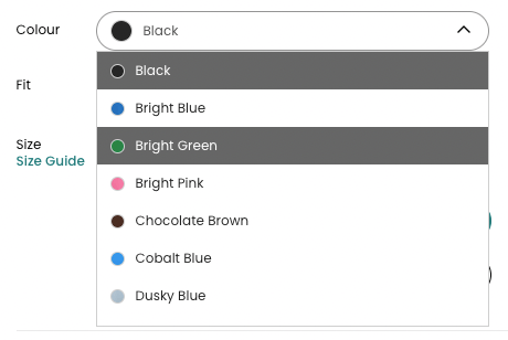
It’s important to give context to your users through descriptive text. By writing descriptive links it aids with navigation and giving clear product descriptions can help a buyer to decide on their purchase. If using items such as a colour picker on your store, adding a description next to the colour or a text label when hovered over will remove online barriers, especially for people who are colour blind.
Here are some further considerations to implement to provide a positive shopping trip:
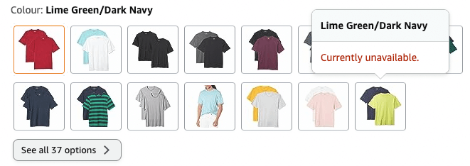
- Avoid using image carousels. Though visually appealing, they can be difficult for users to control. This can provide a distracting and overwhelming experience.
- Implement large clickable areas with sufficient spacing between website elements. This will reduce the risk of users selecting the wrong item.
- Give users time to complete actions by removing page timeouts.
- Ensure shopping carts give a visual and auditory alert when adding items to a basket.
Present users with accessible digital adverts
Adverts play a crucial role in enticing customers to your store and lead them to making that all important purchase. This is particularly the case with imagery and video content. However, there are more considerations to make than just ensuring these are of high quality.
The use of inclusive imagery
Though your imagery may be eye-catching, not all users can view what you are presenting. This is why the alt text feature is essential for online stores. Blind people and users with low vision, who use a screen reader to access a platform, need to know what you’re displaying. They are there to buy a product and they aren’t going to do so without having a description read aloud to them. Take clothing for example, would you want to buy an outfit if you didn’t know the colour, length, style or fit?
You use imagery to lead your customers on a journey through your digital store. This same experience should be given to all users. Imagine if you had to click on every single image to be able to find out more information when scrolling through a site, it would soon become a frustrating experience.
Therefore, it’s important to:
- Write accurate and relevant image descriptions for all pictures.
- Use alt text in the correct way when using an image for link purposes. In this case, don’t add a description of the image, in the alt text let the users know where they will be directed.
Display accessible multimedia

Video adverts are a marketer’s dream, but they can be a nightmare for many users if they aren’t inclusive. Along with adding captions to videos, which allow Deaf and hard-of-hearing users to have equal access to your content, there are other considerations to bear in mind:
- Adverts which auto-play should be disabled as they can cause panic and disorientate many users.
- Give control to your users by displaying media player controls. Let users adjust the volume, size, and take their time over viewing adverts.
- Provide video transcripts and descriptions to assist blind users.
- Protect people watching your content by ensuring videos don’t flash or blink, which could trigger a seizure.
The problem with pop-up advertisements

Pop-up adverts are found across most retail websites to try and grab your visitors attention. They still might achieve this, but for a very different reason as pop-ups are renowned for being inaccessible.
Pop-up adverts not only leave users missing out on important information and discounts, but can actually prevent people from accessing your store altogether. This is because they often aren’t designed to work with assistive technology, especially screen readers and screen magnifiers. Also users with low vision can find these challenging, as the X to close the window is too small or has low contrast. Often, pop-ups leave users stuck, not being able to close the window, and normally having to leave your website.
Instead, information should be displayed within the main web page’s body. If you really must use a pop-up, a warning should be given beforehand for users.
Empower your shoppers by providing an enhanced customer service
Like physically being within a shop, if you’re faced with a problem you’d want to speak to a member of staff. This is also the case for your online shoppers. It’s important to provide varying contact methods, including both a phone number and email address. Alternatively, present an online form or chat facility for people to get in touch. These should be placed in a consistent location site wide.
Beyond this you can help users by providing an accessibility statement on your platform. This will let people know if there are any sections of your platform they won’t be able to access and a roadmap of when they will be able to do so.
Optimise your payment facilities and combat shopping cart abandonment
Having a simple checkout and payment process is critical for any store. However, this is the area where so many businesses get it wrong when it comes to accessibility.
Your users should be able to fill in details and check out an online shopping basket with the use of assistive technology. This includes without the use of a mouse.

Filling in form elements to complete a purchase
- The first step is to make sure that all instructions are clear and easy to understand when completing an online form. Let users know what to expect during the process and what will happen after completion of the form.
- Ensure all form elements can be completed using only a keyboard.
- Each form field needs to be labelled, so that assistive technologies can identify them for users. Forms without labels can be impossible to complete for screen reader users.
- Entering repetitive information on a website can be a frustrating experience for everyone. For users with cognitive disabilities, who may struggle to remember what information they have entered previously, this can also lead to anxiety. By ensuring information can be auto-populated makes sure users don’t have to enter the same information again during the same process.
- Check your colour contrast ratios. Often, form labels appear pale in contrast, to make other elements stand out. However users with low vision will not be able to read this content if this is the case.
- Give a visual indication of where users are when tabbing through form elements.
- Some people struggle to solve puzzles, memorise information like usernames and passwords, or find it difficult to retype one-time passcodes. Therefore, removing cognitive function tests can simplify the authentication process.
- When integrating an application programming interface (API), make sure to offer a variety of payment options. This should include Apple Pay, Google Pay, PayPal and major credit cards.
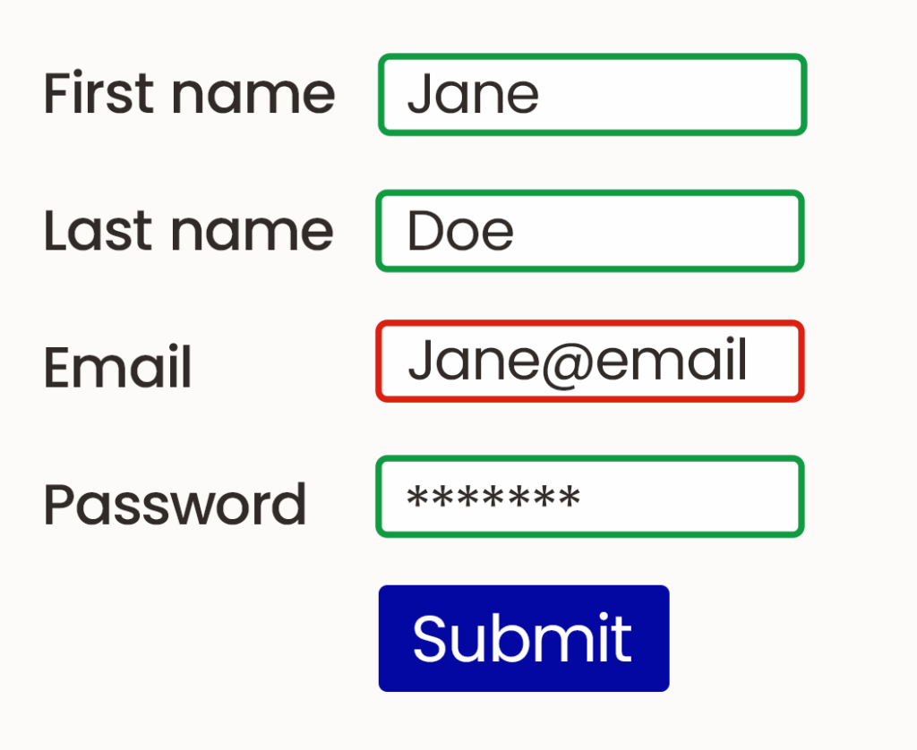
Provide accessible error messaging
It is inevitable that some users will make a mistake when completing a purchase. So, it’s important to let users know which form element they have not completed correctly.
Often, this is highlighted in red, however this can cause problems for colour blind users. Instead, use icons to point users to where there is a problem.
A bad form example:
A better form example:
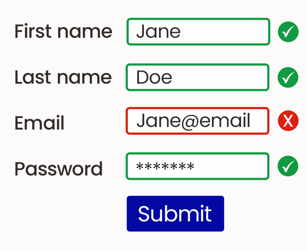
Better still, add an error message detailing exactly what item needs rectifying, why the problem occurred and how to fix it.
Need help in providing an accessible ecommerce platform?
We offer complete ecommerce development; encompassing consultation, design, implementation, database integration, hosting and support services.
We can tailor your ecommerce solution to you, making sure your online store looks and feels exactly how you imagined it. We’ll work with you to design your ideal ecommerce solution, turning it into an attention-grabbing, high-converting online shop, which is accessible for all to use.